
Overview
Evian’s mission statement is “provide our natural mineral water in the most sustainable way.” This project was set out to emphasize the importance of that statement while reconnecting with the original spring Marquis de Lessert, where the water source was originally discovered back in 1789. Evian’s sustainability journey is led by their three focuses; Packaging and recycling, Source protection, and Climate impact.
This ad campaign was designed around highlighting Evian’s sustainability efforts while keeping their clean, refreshing appearance. The use for this design is to be displayed as a three slide carousel post on the main instagram page @evianwater.
Programs Used:
- Clip Studio Paint Pro
- Adobe Photoshop
Parameters:
- Three separate posts to form an instagram carousel
- All Image will be portrait size of 1080px X 1350px
- Images will contain text about sustainability approach
- Evian bottle and name will be featured in each image
Project Timeline: 1 week
Background
The purpose of this design is to become an instagram post that fits with the @evianwater official instagram account. There will be a total of three posts to create a carousel that highlights Evian’s three approaches to sustainability; Packaging and recycling, Source protection, and Climate impact.
Packaging and recycling:
Evian emphasizes eco-friendly practices in packaging, adopting a circular model with steps in raw materials, production, and use, ensuring bottles are recycled back into production. The company pledges to use 100% recycled PET for all plastic bottles by 2025.
Source Protection:
For 25 years, Evian has protected its original water source, conducting over 300 daily tests to maintain quality. The Terragr’Eau methanizer converts farm waste into fuel, showcasing a commitment to environmental responsibility.
Climate Impact:
Evian strives to reduce its carbon footprint throughout the bottle life cycle. Transportation efficiency is prioritized, with 90% of bottles transported by train. Recycled PET packaging has 30% lower carbon emissions, and the company has achieved a 44% average of recycled PET material. Energy consumption per bottle has decreased by over 25% from 2012 to 2022, and the production site runs entirely on renewable energy from hydropower and biogas.
Journey
Mockup

I began with drawing small thumbnail concepts to create a wide range of ideas for this project. I stuck strictly to the evian color scheme while using complimentary colors to blend in with each concept.
Evian Official Colors:

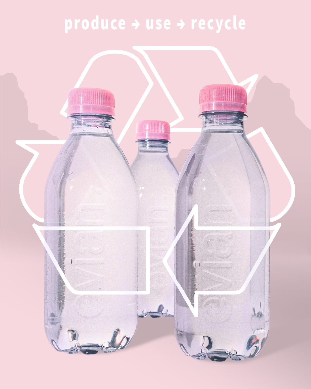
Image One

The first post is intended to resemble and harmonize most with the main feed of the official instagram page. The recycling symbol is a smart object that is able to be recolored by the user who wishes for a different fill or line color.
Here are some more details about the design decisions and functionalities:
- Subject
- The subject of this design is the label-free evian bottles that are used as their 2025 pledge to become 100% rPET.
- Color correcting was used to place more pink and purple tones into the bottles.
- Symbol
- As stated above, the recycling symbol is a smart object that will allow a user to change the line and fill color of the symbol if they wish too.
- A mask was placed around the bottles to better lead the viewer’s eyes around the image.
- To avoid covering the evian label, a mask was used to make the fill color more transparent while keeping the harsh white outline to give the illusion that the symbol is placed on top of the bottles.
- Text
- The text was inspired on the “circular model” in which the idea is to produce, use, and recycle the same bottles to avoid all of their bottles from turning into more waste.
- This model also pushes their 2025 pledge, in which highlights evian’s passion for reducing their overall waste and improving the environment.
Instagram Test
Because the first image posted will become the main image displayed on the instagram home page, I have included an image to show what the post will look like if posted. The image is taken from a mobile iphone and shows the result in both light and dark mode. The first image on the page is the final design of the first post.
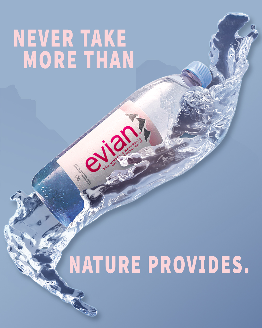
Image Two

The second design is focused on source protection, a deep foundation for Evian’s strive to ensure their water is protected for generations to come. I brought attention to Evian’s official quote, “Our commitment to spring preservation runs deep. We never want to take more than nature can provide so the source can continuously replenish.”
Here are further details about the design and functionality:
- Subject
- The subject or main focus of the design is the classic Evian bottle to which most consumers are familiar with.
- I used a water splash to accentuate a level of “freshness” to further push the concept that Evian water continues to be clean and protected through the companies vast conservation efforts.
- The background resembles the background of the first image to continue a level of harmony between the two designs.
- Text
- I used a shortened version of Evian’s official statement about source protection to create a lasting and snappy punch.
- The text is colored pink to flow with the first image, which creates a smooth harmony from the swipe transition between the first and second image.
- Effects
- The water splash was altered to look as though the bottle is being held within it.
- Color correcting and various blending techniques was used to create a more seamless blend from the first element, the evian bottle, to the next, the water splash.
Image Three

The final design is to bring attention to Evian’s climate impact focus. Evian has worked hard to ensure their carbon footprint is minimized through the use of trains rather than trucks to transport their bottles. This last design is intended to bring a closure to all three images while creating a simple call to action.
Below is more information about the design and functionality of the image
- Subject
- The evian bottle is edited using camera raw filter on photoshop, and used as a soft overlay to help balance the blue and pink colors. I chose to keep the evian bottle slightly transparent to keep the integrity of the brand, allowing for the evian label and cap to still be reconIzable.
- I wanted this final design to tie back to the first two, which was primarily pink, then blue. Mixing both colors can lead to a harmonious end to the trio of images.
- The background is a color-edited version of the alps mountains in which evian water comes from. This ties back to the roots of the company and helps push brand recognition.
- Effects
- A bubble texture was placed on the bottle to go with the fish, giving a more “underwater” appearance.
- The fish were both individually edited using camera raw, the top fish matching more pink like the sky while the bottom matches the blue of the alps in the background.
- Text
- A call to action for the final image helps to give a deeper purpose to the instagram post. It will help increase traffic and set the idea that by buying evian products, one is helping to fund for climate protection and environmental preservation.
Conclusion
Challenges:
- Color harmony was extremely important to the design of these images. While each image was made separately within photoshop, it was imperative to continue color matching and swatching to ensure that the colors between designs would have a natural flow.
- For the final image, the main concern was composition. The use of texture wasn’t necessary, however we wanted to find a way to incorporate an element that was unique to the first two designs. Originally, the bubbles were a backdrop in the sky, but the idea to incorporate them into the bottle similar to how the fish were incorporated helped to solidify a unified composition.
- The final large-scale challenge was incorporating Evian’s sustainability goals into each of the three posts without looking like a copy paste of each other. The use between water and fish helped to separate from water protection to climate protection, while we limited the three posts to only one symbol; the recycling symbol.
Final Thoughts:
This project was more than just an ad campaign for me. Ever since I was young, I was drawn to Evian as a company. Their colors and overal desings made me feel like a free spirit living in the french alps. Their desire to continue to produce clean sustainable water has been an inspiration to me and I only continue to learn about the amazing efforts they make to help our planet. Working with their colors and visuals allowed me the opportunity to dig into their desing choices and how they continue to sell a brand recognition that should be desired by every company.

Leave a comment