Overview
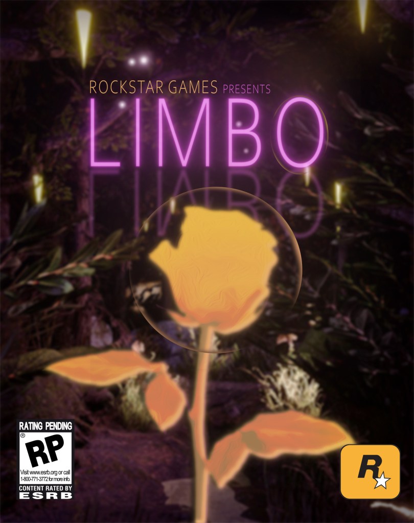
To continue Limbo’s story, I wanted to imagine what the physical case may look like. I chose Rockstar games as the company behind the design because it best reflected the style of the original game title design.
Limbo Concept:
Limbo is an action-adventure game that follows a main player as they just woke from a near death experience. Since then, they struggle between shifting from the normal world to limbo, which is a space in time where souls wait around aimlessly for eternity. The player will solve puzzles and fight off limbo souls in an attempt to stop themselves from shifting.
Programs Used:
- Clip Studio Paint Pro (conceptualization and mockups)
- Adobe Photoshop
Variables:
- Limbo title
- Rockstar Games logo
- Case Print size: 6.7” X 5.3”
- Digital Print:
- Rating symbol
- PS5 Case
Project Timeline: 1 week
Background
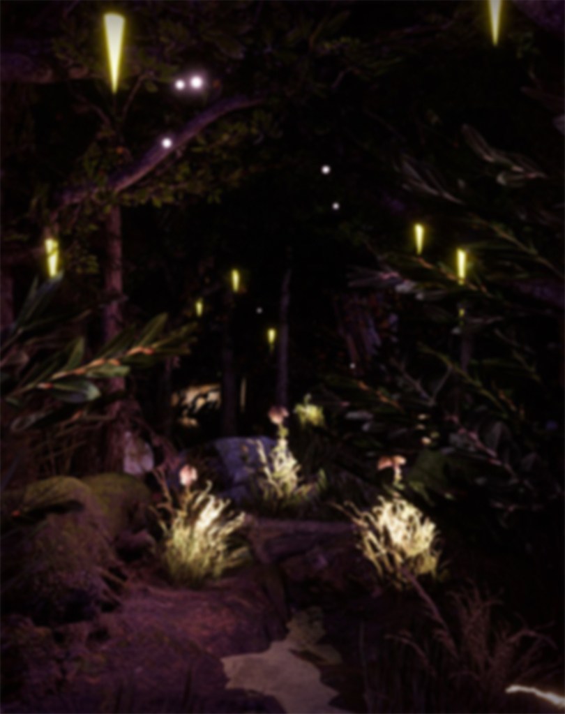
Following the story of Limbo, I wanted to dive deeper into the game while still experimenting with design elements within photoshop.
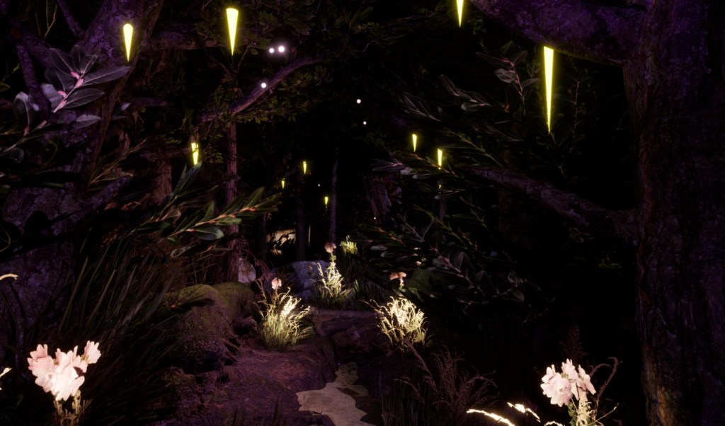
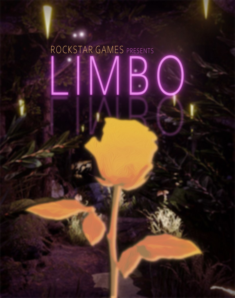
In the animation, I used flowers to create a unnatural glow in the Limbo scene that would be used to help light the players path while exploring Limbo. Researching flowers that fit this concept, I came across what’s known as a Rose Limbo.
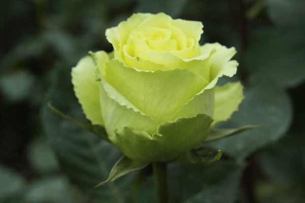
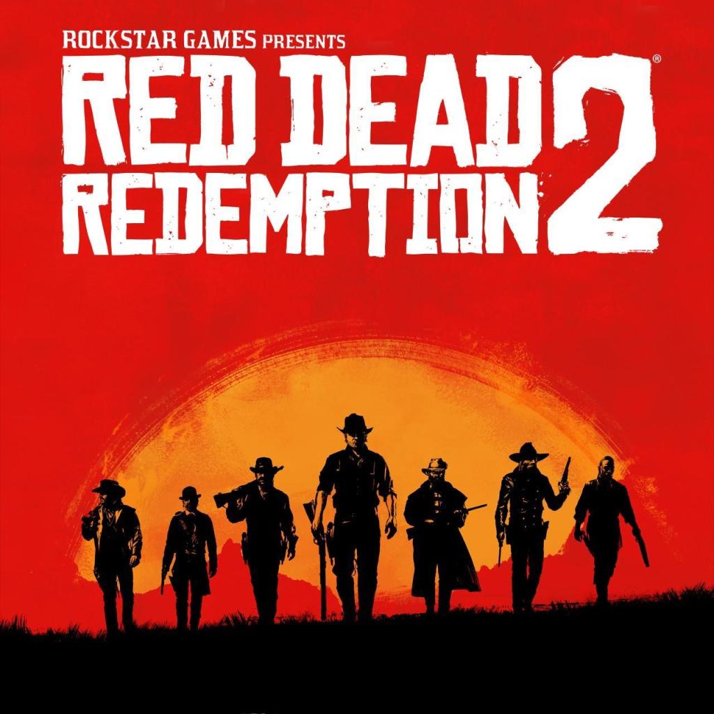
I knew this was the highlight image I wanted to capture at the front of the screen, but deriving inspiration from game titles like Red Dead Redemption 2, I also wanted to create a blocking effect to reduce detail while while building on more contrast.
Journey
Starting out, I took a wide color scheme from Limbo’s title screen animation and narrowed them down from day part and night part.


Following the colors, I designed a few mockup thumbnails to start visulizing ideas for the project.
Mockups

Heading into Photoshop, I took the ending image from the title screen animation and blured the colors out to create a fuzzy effect.
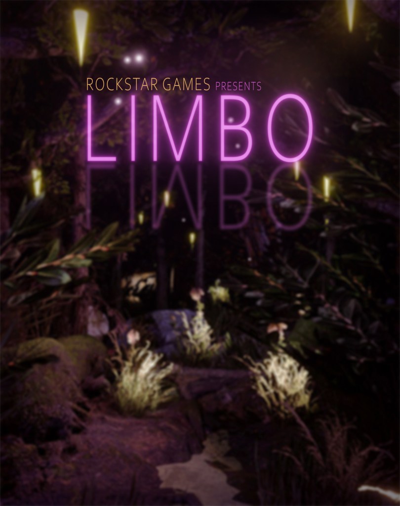


I then brought the same typography used in the original animation and replicated the neon text effect, including the “Rockstar Games Presents” starter to help fit the chosen client for this project. Color correction and adjustments were used to create pops in colors to contrast the dark background in the scene. Adding a rating symbol and the Rockstar Games logo was neccessary to showcase the final product that would be seen in stores.
Final Product
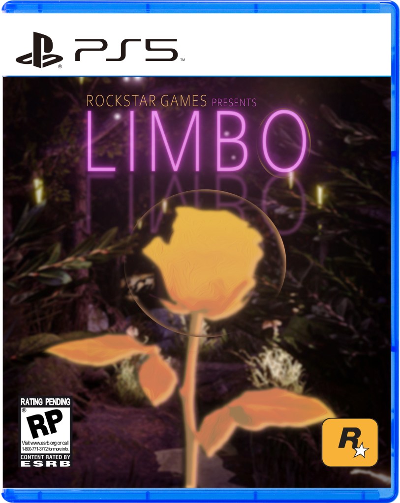
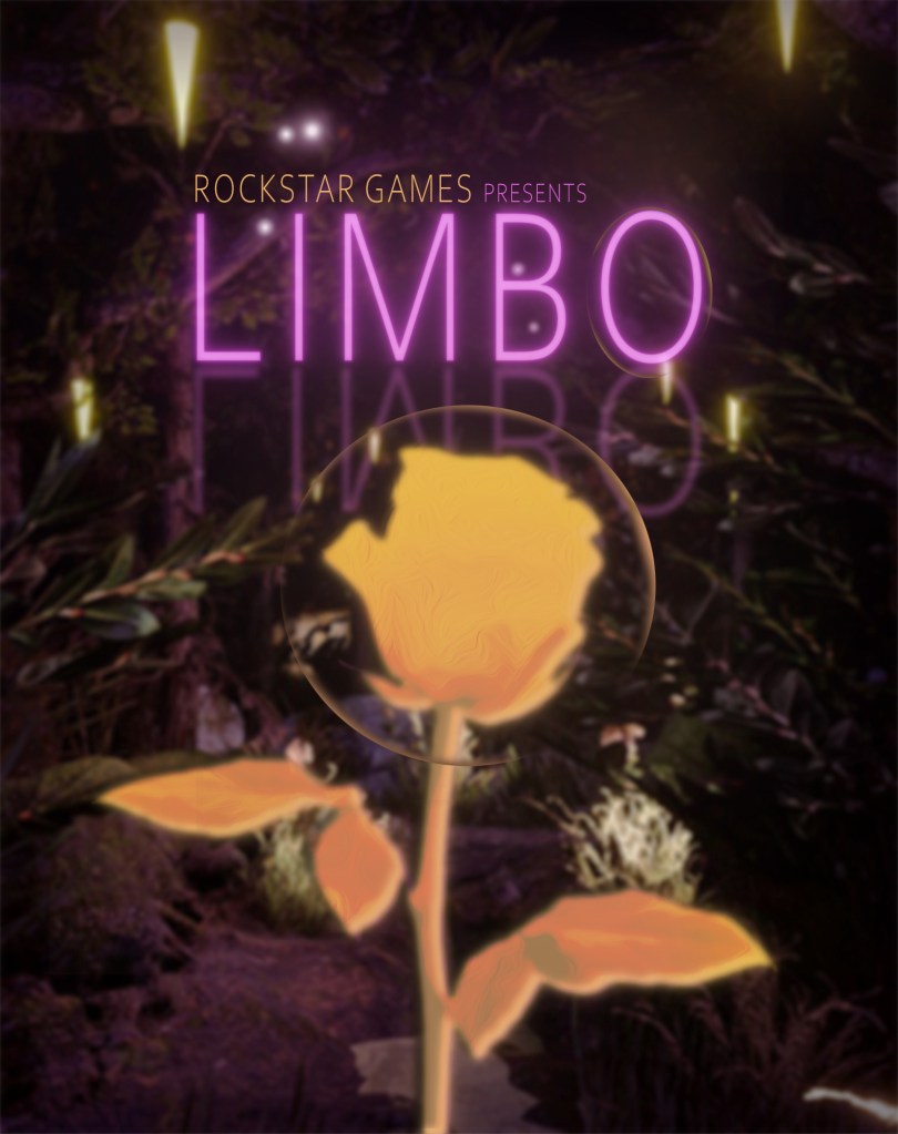
This incorporation of the case is used to help show the client exactly how the final product would look on a PS5 case.
Conclusion
- Why did you start this project?
- I created the title screen for a made up game, and I wanted to see what other ways I could build up on it. I was interested in advertising for it, and expanding on a previous project would be a cool story to demonstrate in a portfolio.
- Who is the intended audience and why?
- The intended audience for this project would be action story game lovers, which research shows ranges all genders 16 to 34 years old. With this audience, I wanted to create a cover that reflected the simple story from the original game title screen creation. At the same time, I wanted to take the themes of other rockstar titles so the audience could associate the case with previous games under the title. The other audience would be Rockstar Games, which is why I added the PS5 case variation to show them a better picture as to how it would look on a physical case.
- What is your intended impact for this audience?
- Originally, the screen switches from a normal day to a night scene with a heavy vanderpump color scheme. While looking at other rockstar game covers, I noticed they stuck to a limited but effective color scheme. Mainly, I was drawn to the red dead redemption 2 case, which limited its colors to reds, yellows, and black. This is to create a cohesiveness with the game itself as well as rockstar games as a company. For the player audience, my intention was to create a case that reflected how mystical the title screen looked. It’s meant to attract an audience who is interested in action story games but might not want to have hardcore masculine themes like common war games. With this in mind, the game is meant to look warm and mystical.
Key Goals
- Key Goal 1: Color Scheme
- Rockstar Games tend to stick to strong color schemes, whether thats for simplicity or aesthetics, I limited the colors to match their previous titles. The color is made up of golds, purples, and greens. This helps to create a cohesiveness with the piece as well as guide the readers eye into the center rose.
- Key Goal 2: Theme
- The title screen for this game came out as mystical, so I wanted to portray that theme through the case. Originally, the center rose was extremely detailed and realistic, but I found that too distracting, especially when referring back to the Red Dead Redemption 2 case. I then changed the rose to look flatter, and blurred the background to help create a more harmonious composition.
